Redesigning the travel experience for Priority Pass members
Priority Pass — the member app
Product design · Onboarding · Offline — 383 Project with Collinson
The Challenge
Through existing research and product insights, several key challenges became clear:
- Friction during login and verification caused delays and confusion
- Onboarding did not clearly communicate the value of the app
- Membership and pass information lacked hierarchy and clarity
- The visual experience was inconsistent across platforms
- Travellers often relied on the app in places with poor connectivity
- The digital brand needed to reflect a premium and trusted experience
The work required improvements to both the functional flows and the overall digital identity.
Guiding Principles
The design team’s documented principles for the app — the frame every decision got tested against.
- Intuitive — predictable, familiar, low-friction
- Familiar — use known patterns to reduce learning effort
- Premium Utility First — surface high-value features instantly
- Design for Failure — flows resilient to poor connectivity
- Simple — reduce cognitive load
- Accessibility — inclusive, robust, WCAG-aligned
- Customer First — every decision increases clarity and trust
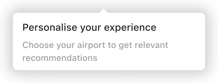
The one that shaped my work most was Design for Failure. Members open this app in the one place connectivity reliably fails — so the pass, onboarding and key assets had to work with no signal at all. Offline mode wasn’t a feature on my list; it was the constraint under everything on it.
User needs
From existing research and experience data, users needed:
- Reliable access to their digital membership/pass
- Faster, clearer login and verification
- A quick understanding of the app’s value during onboarding
- Predictable patterns while travelling under time pressure
- Offline access in airports with weak Wi-Fi
- A premium, trustworthy visual experience
- International accessibility
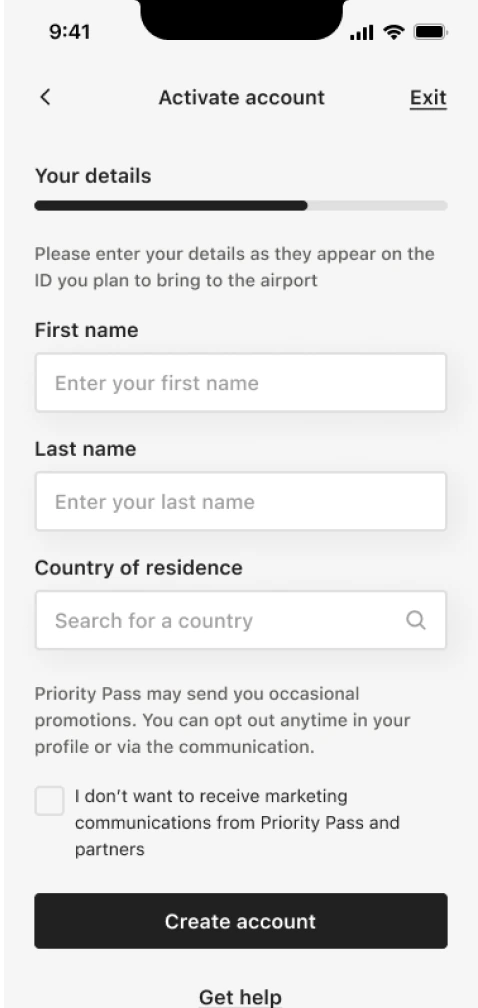
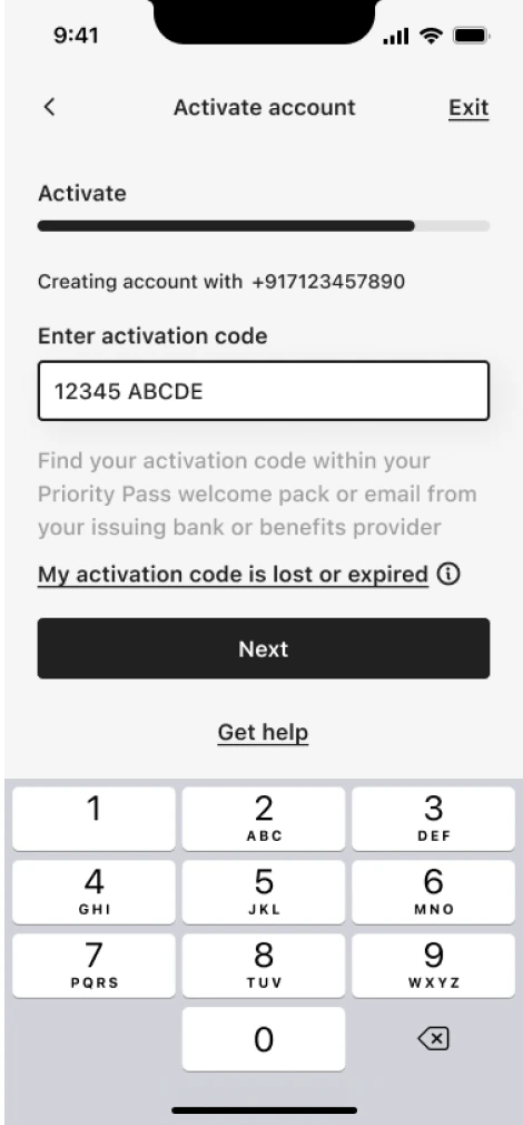
Login & Account Access
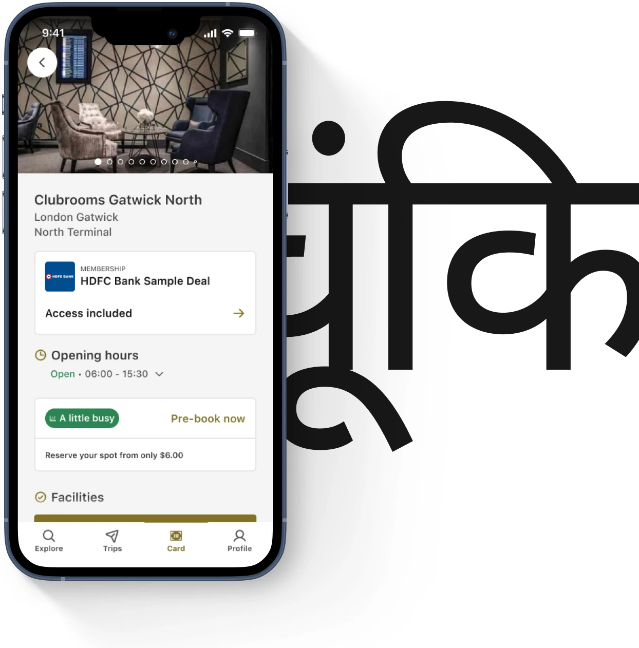
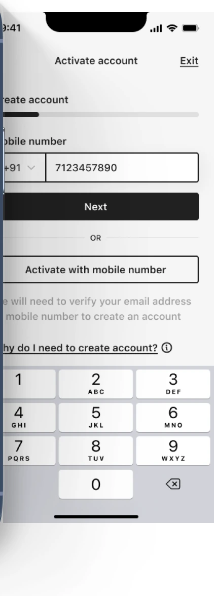
Travellers often attempt login under pressure at airports. The flow needed to minimise friction, guide recovery, and align with consistent component patterns.
- Simplified the login entry point
- Created clearer recovery pathways
- Balanced brand with functional clarity
- Refined error handling and state messaging
- Ensured accessible inputs using the design system
- Supported multi-account/membership scenarios
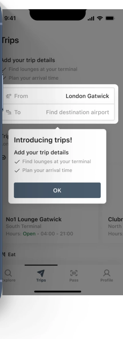
Onboarding
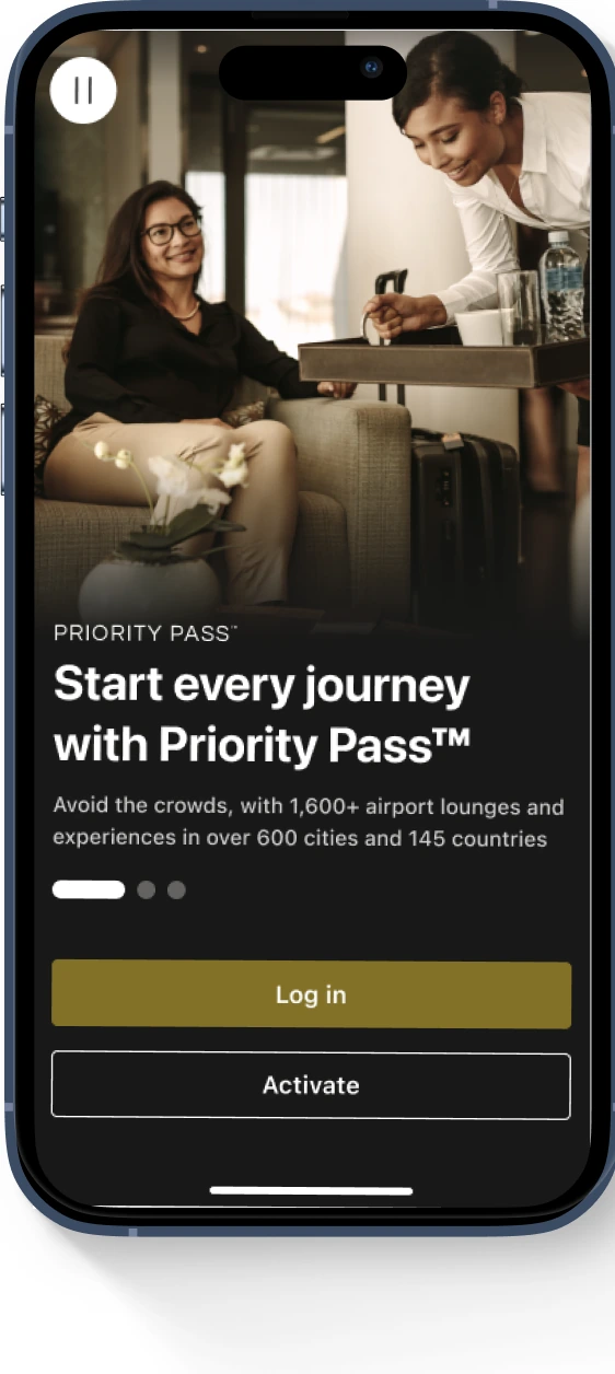
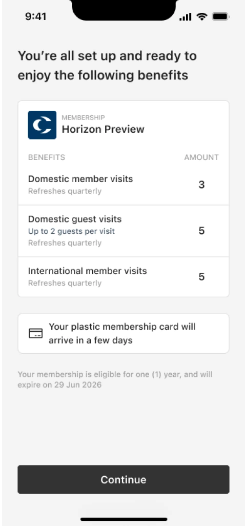
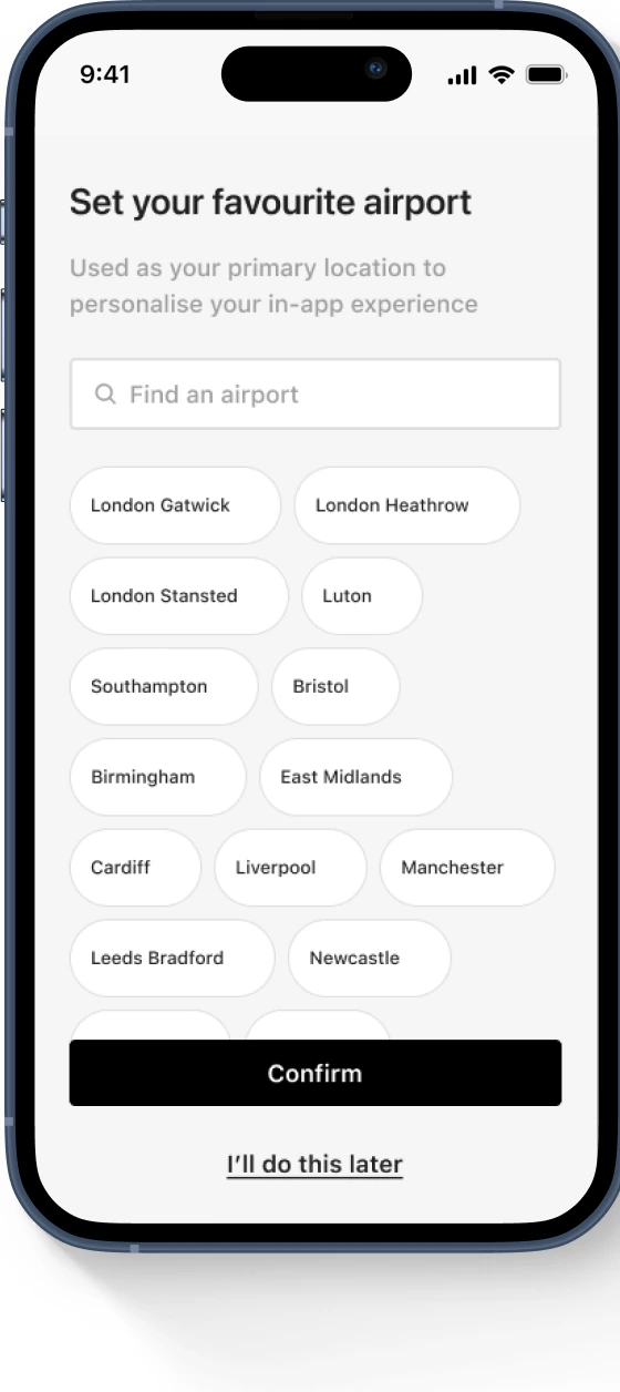
Onboarding needed to introduce value quickly without slowing users down or overwhelming them.
Approach:
- Created a modular, repeatable onboarding framework
- Introduced high-value features early (lounges, membership)
- Reduced copy and visual noise
- Reinforced premium tone through brand colours & imagery
- Ensured accessibility across global markets
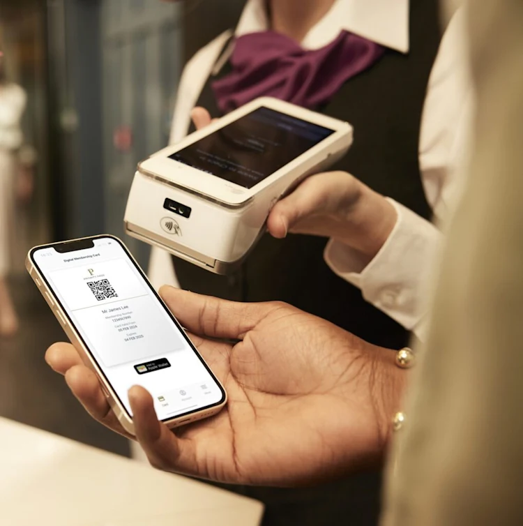
Membership Wallet & Digital Pass
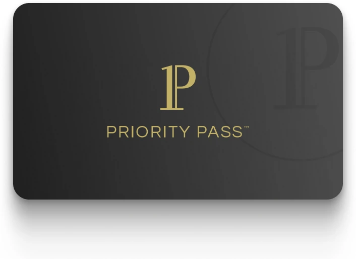
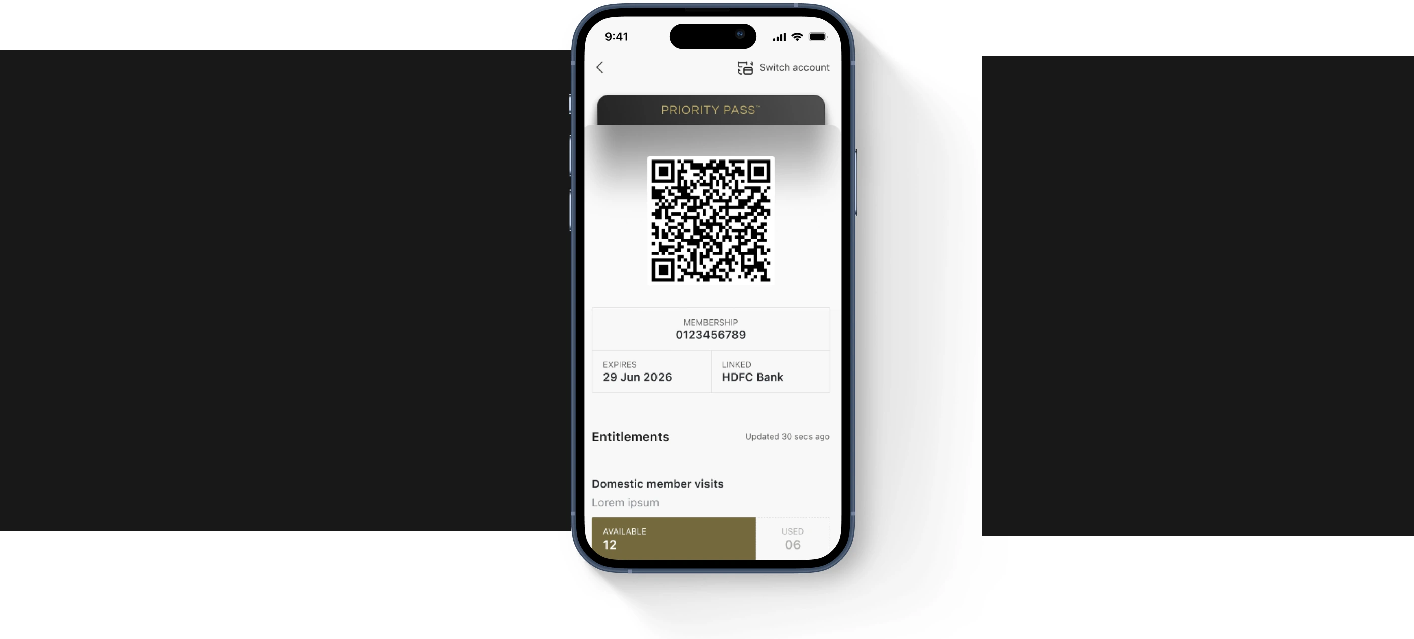
The membership screen is one of the most critical and most used, screens. It needed to feel premium, be instantly scannable, and work offline.
Improvements:
- Clear hierarchy for membership status, expiry, QR, and card details
- Simplified layout optimised for scanning at lounge entrances
- Introduced new brand type, spacing, and visual rhythm
- Ensured key assets cached locally for offline use
- Created scalable patterns for users with multiple cards
Browsing & Lounge Discovery
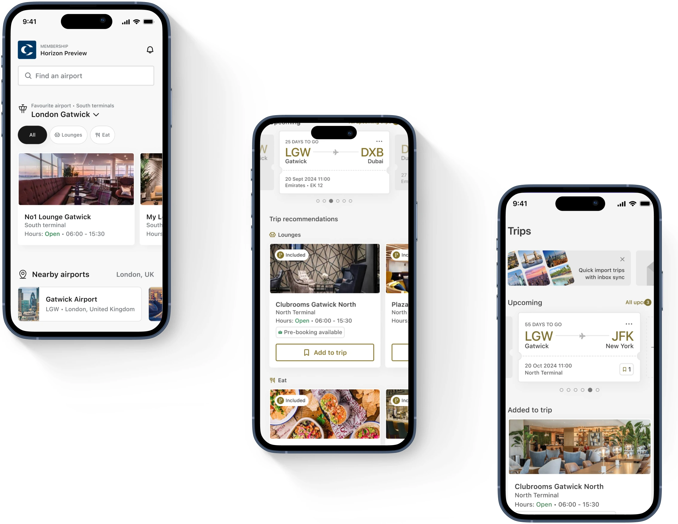
To support travel decisions, the browsing flow needed clearer structure, stronger information hierarchy, and premium yet functional visuals
Improvements:
- Refined card layouts for quick scanning
- Strengthened contrast and readability
- Introduced new brand imagery and tone
- Ensured consistency with other surfaces
Digital Brand Implementation
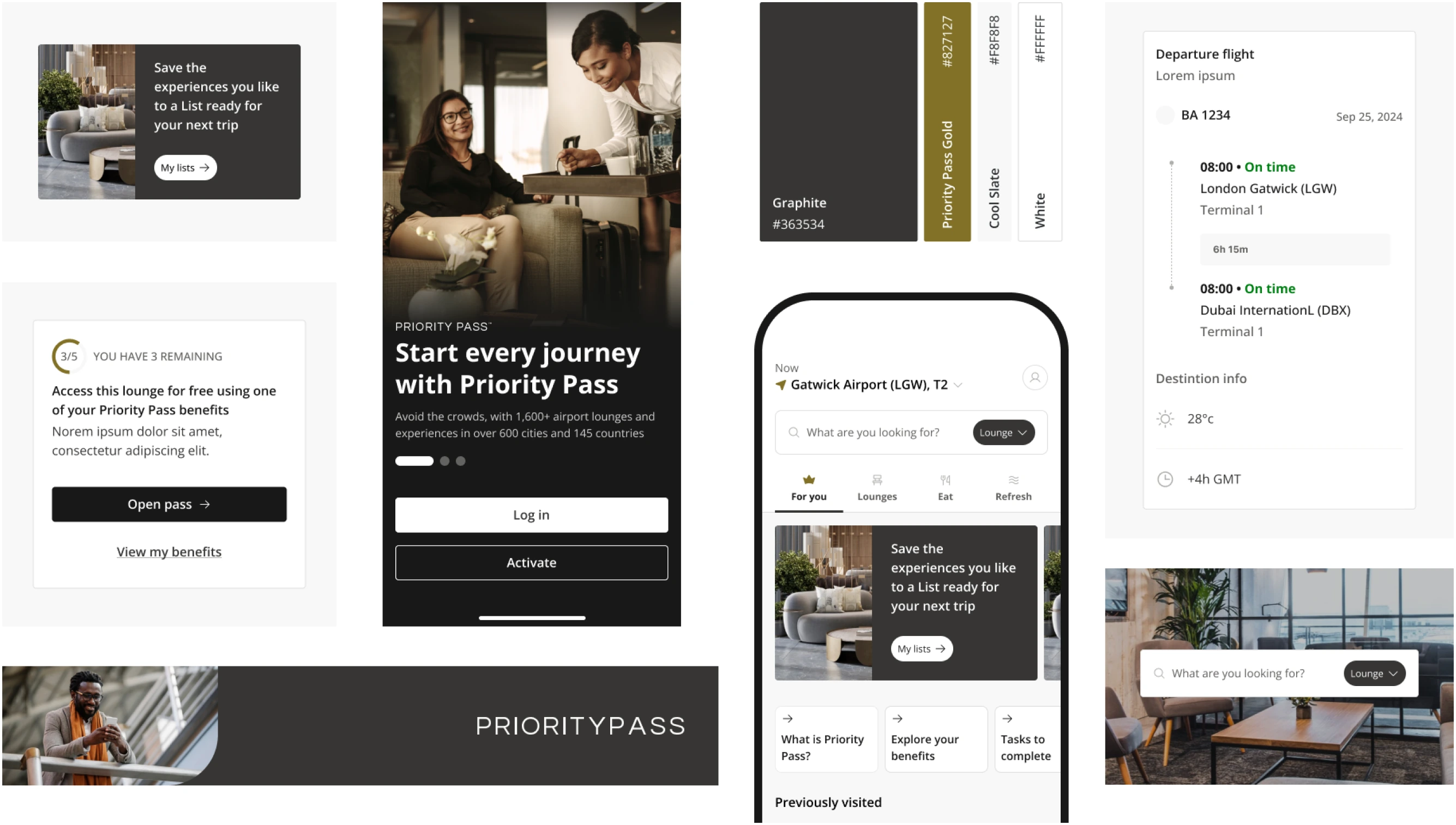
My role was to translate the refreshed premium brand into a scalable digital system.
Contributions:
- Established digital type hierarchy & spacing
- Defined component patterns for forms, cards, buttons
- Applied colour palette & tone consistently
- Built visual rules used across login, onboarding, memberships, and search
- Ensured cross-platform alignment (iOS + Android)
- Documented components for design system adoption